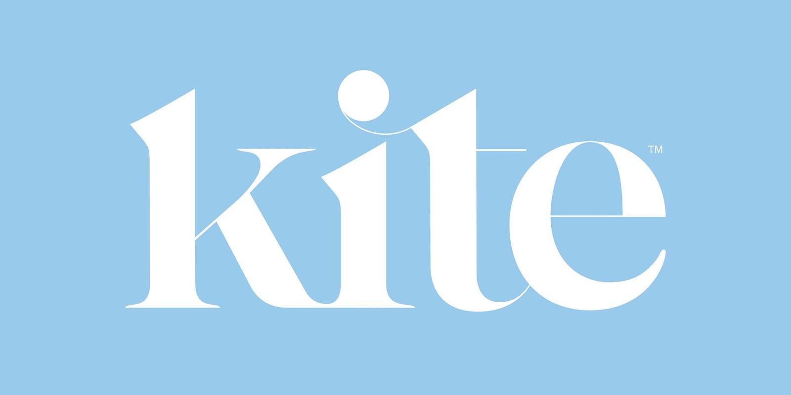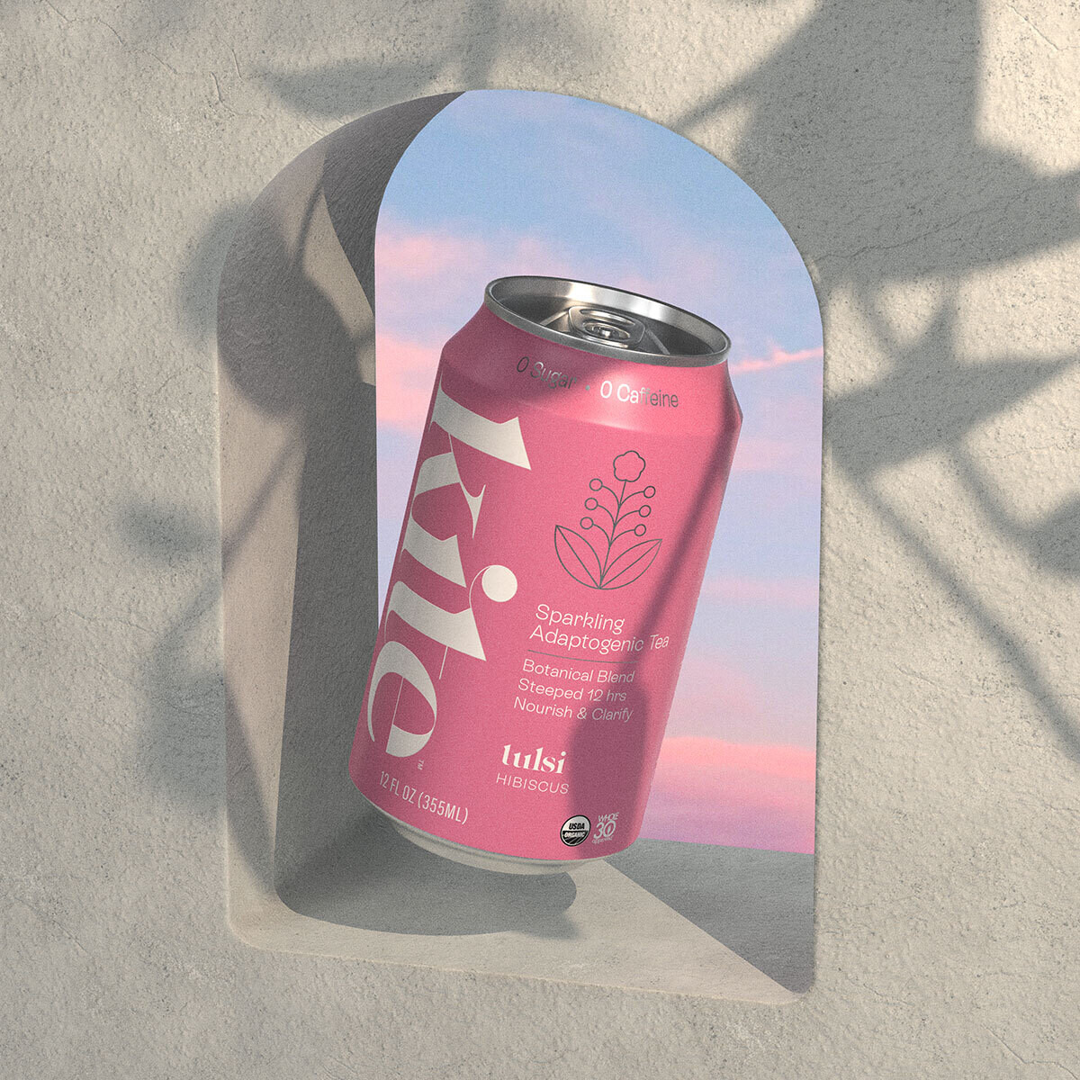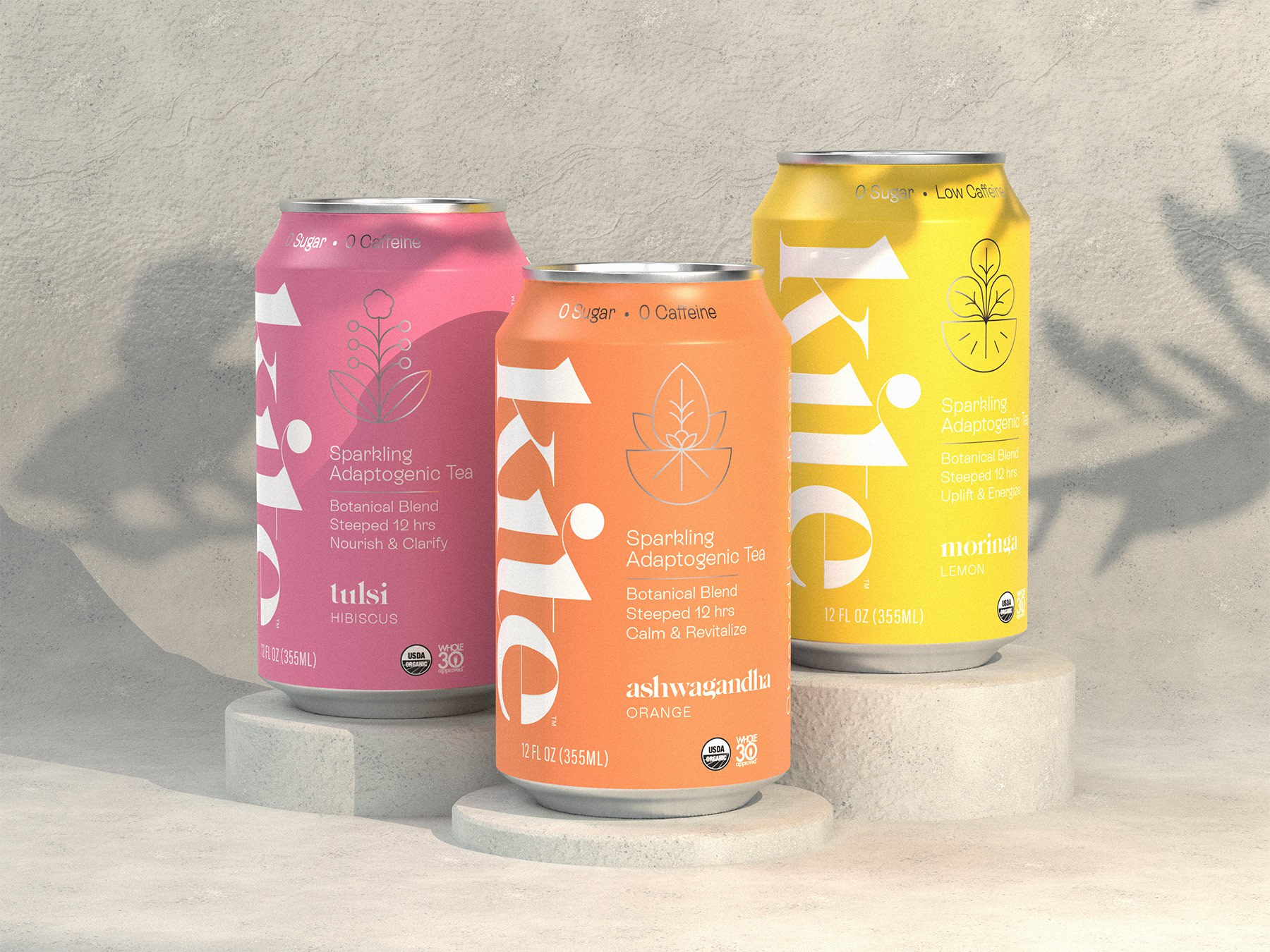
Kite
- Branding
- Packaging
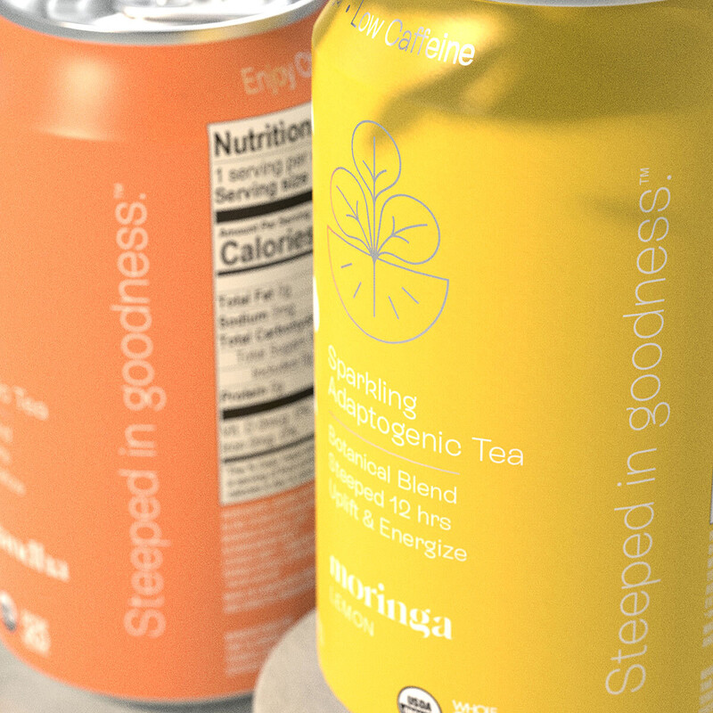
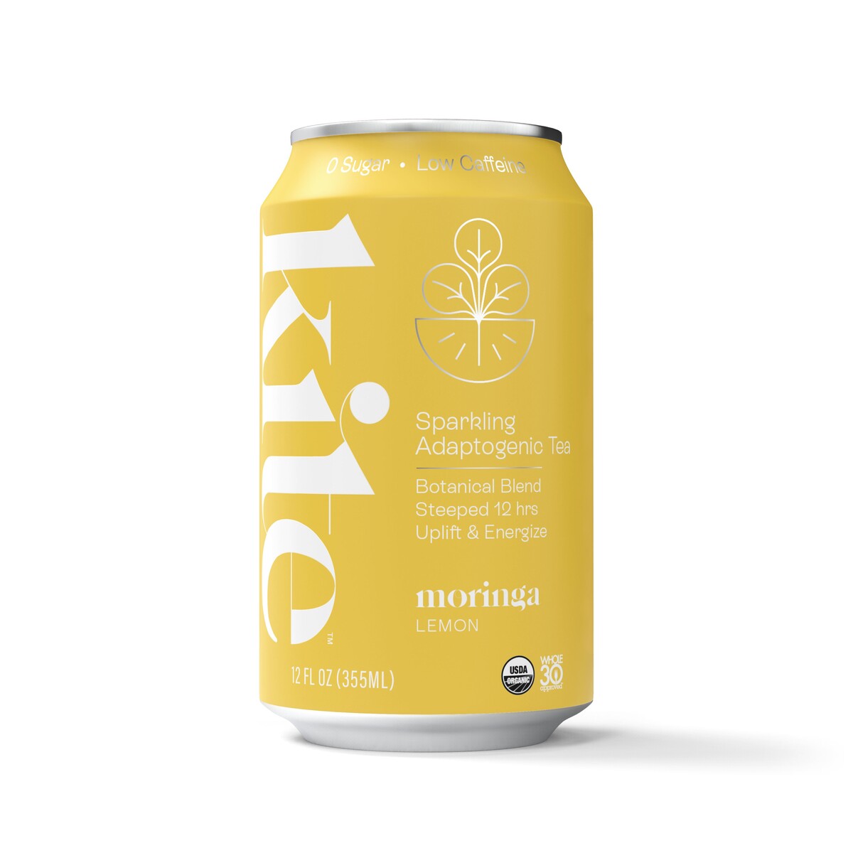
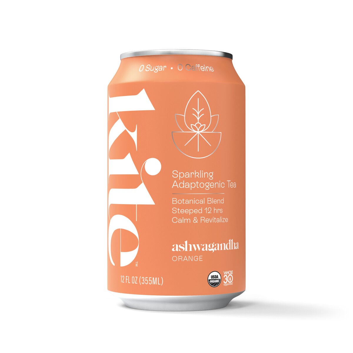
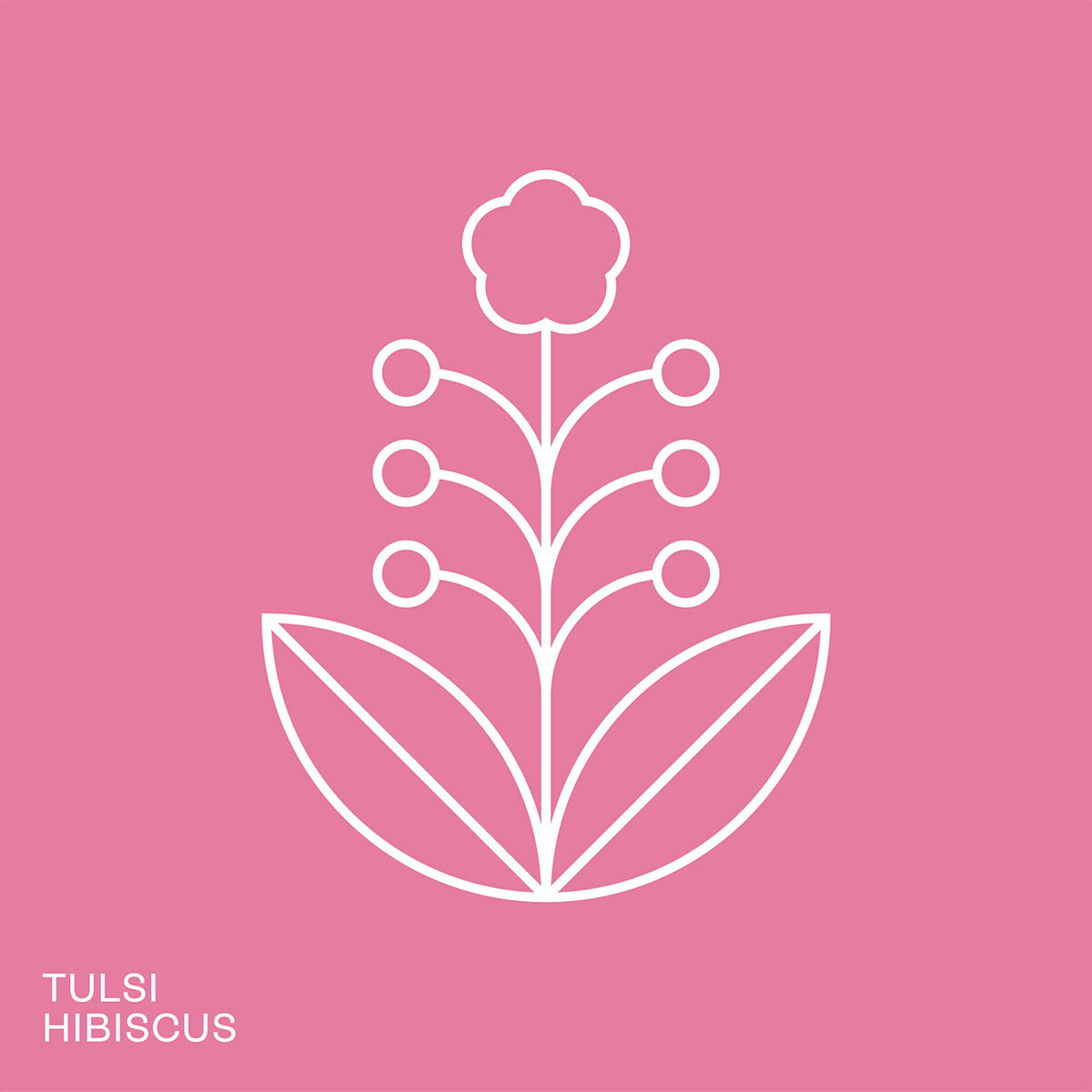
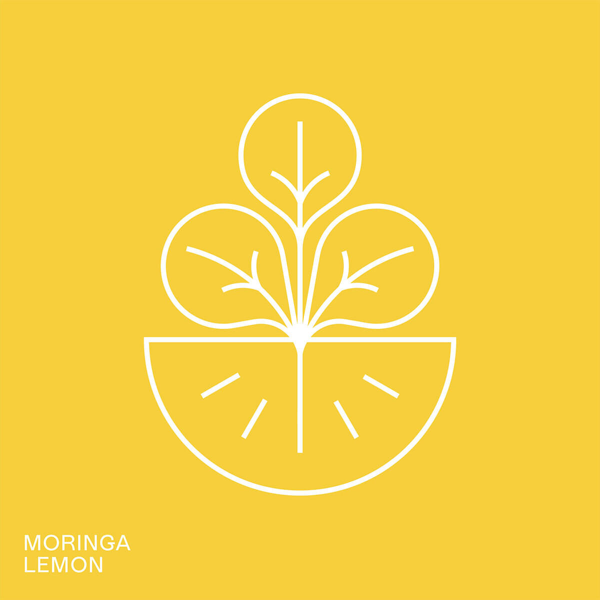
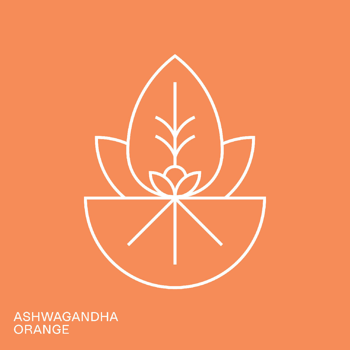
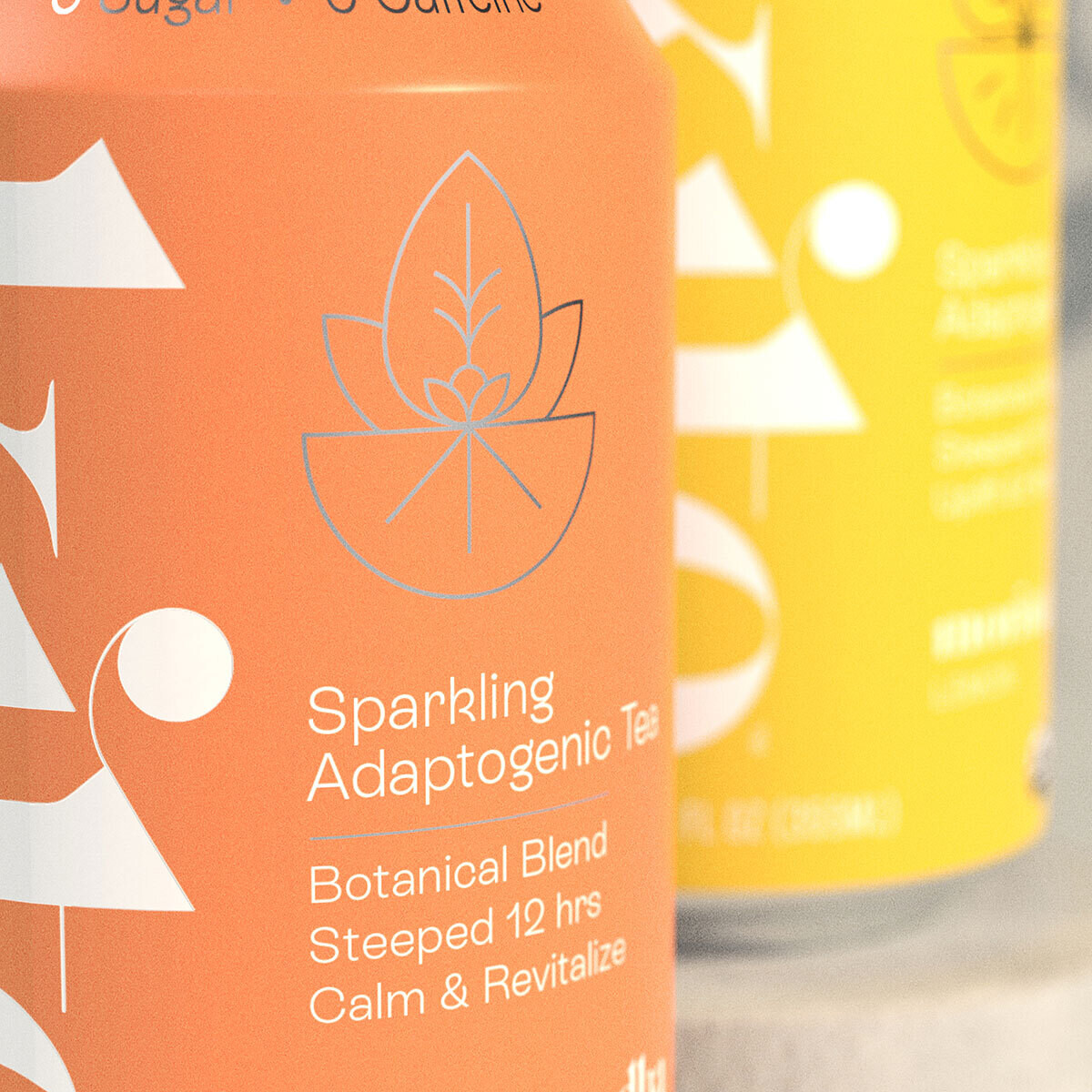
Kite, maker of some truly excellent steeped adaptogenic teas, wanted to realign their brand and packaging with their vision and goals for the future. We worked with them to evolve their design language and visual system to reflect their sophisticated-yet-approachable offering, exemplified by their three flagship ready-to-drink products.
Anchored by a whimsical, ligature-rich logotype, each of the brand’s products differentiate from one another through vibrant colours – each chosen to represent the functional benefit of the adaptogenic ingredients within – and a mono-line illustration representing the two core ingredients within each flavour.